

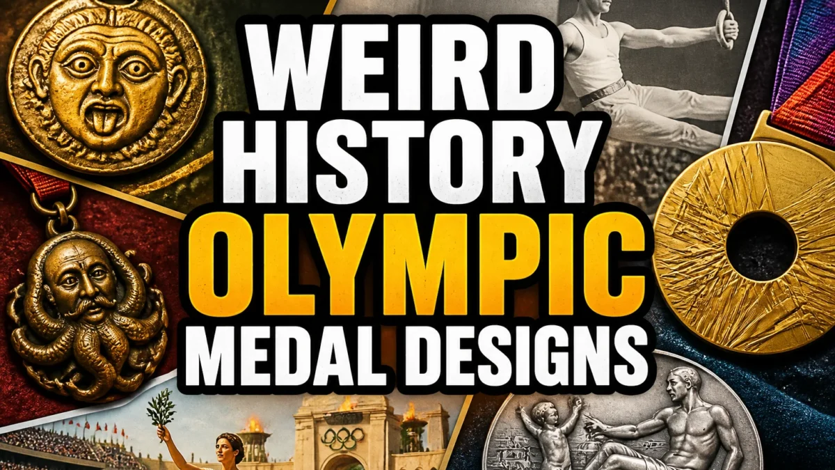
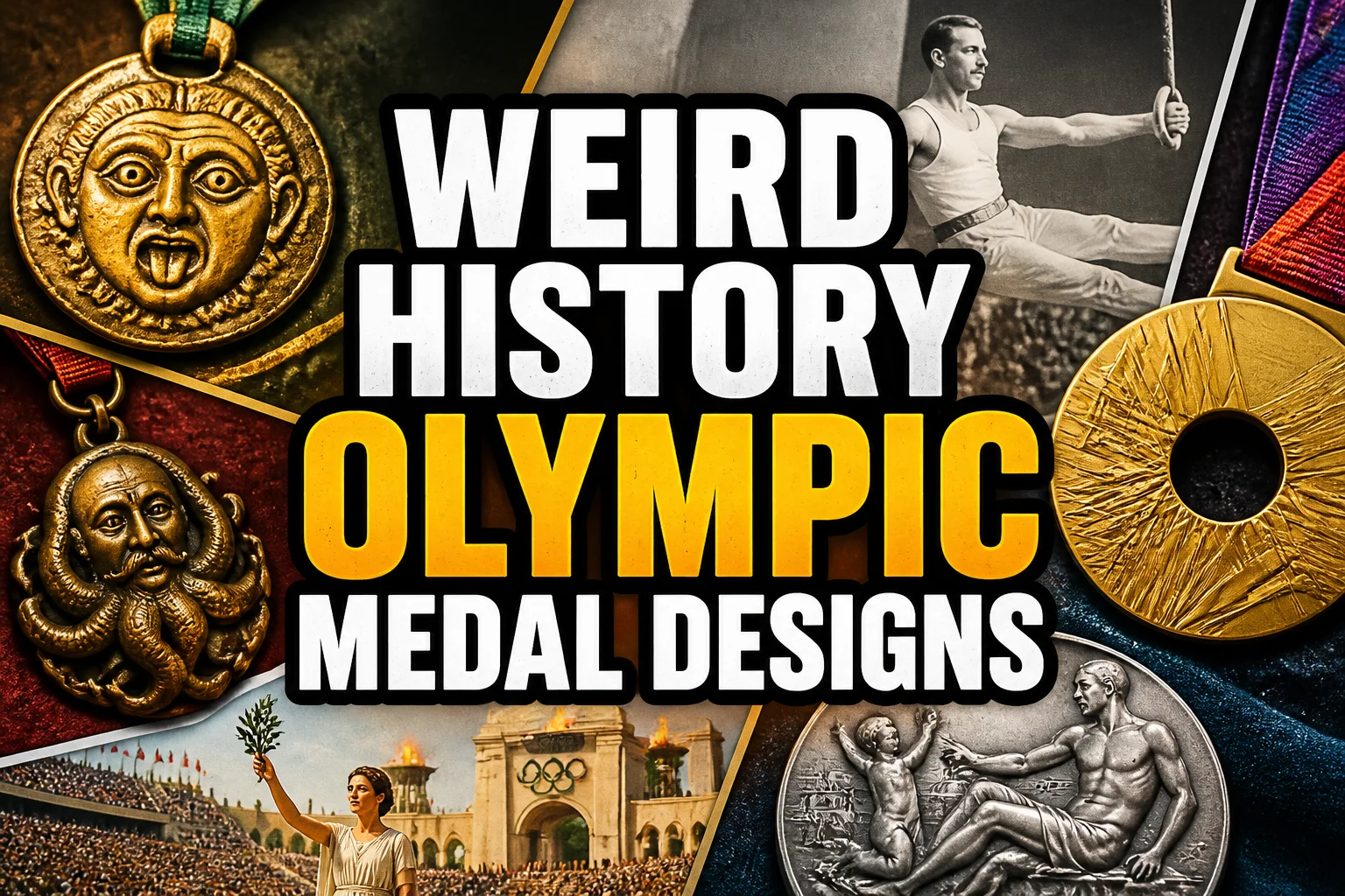
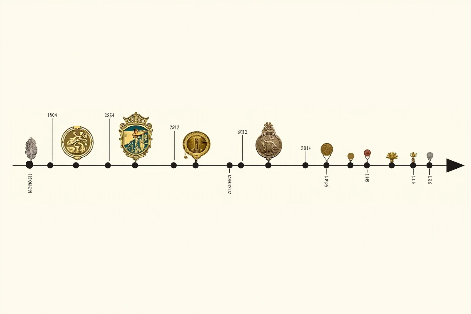
TL;DR: Olympic medal design has evolved from simple olive wreaths to elaborate works of art, with each era reflecting the host city's culture and the Games' growing prestige.
The Olympic medals are among the most recognizable symbols in sports, but their design has never been fixed. What do Olympic medals look like today? Most people picture a gold, silver, or bronze disc with a goddess and a stadium, but that standard image only took shape over more than a century of experimentation, controversy, and artistic reinvention.
This post digs into the weird, wonderful, and sometimes controversial history of Olympic medal designs. We will look at how the medals changed, why they changed, and what the best Olympic medal design might actually be.
1. The First Modern Olympic Medals Were Surprisingly Simple
When the modern Olympics began in Athens in 1896, the winners received a silver medal and an olive branch, not gold. The design featured Zeus on one side and the Acropolis on the other, a nod to the ancient Greek roots of the Games. There was no standard size or weight, and the medals were more like commemorative tokens than the polished awards we know today.
2. Gold, Silver, and Bronze Became the Standard in 1904
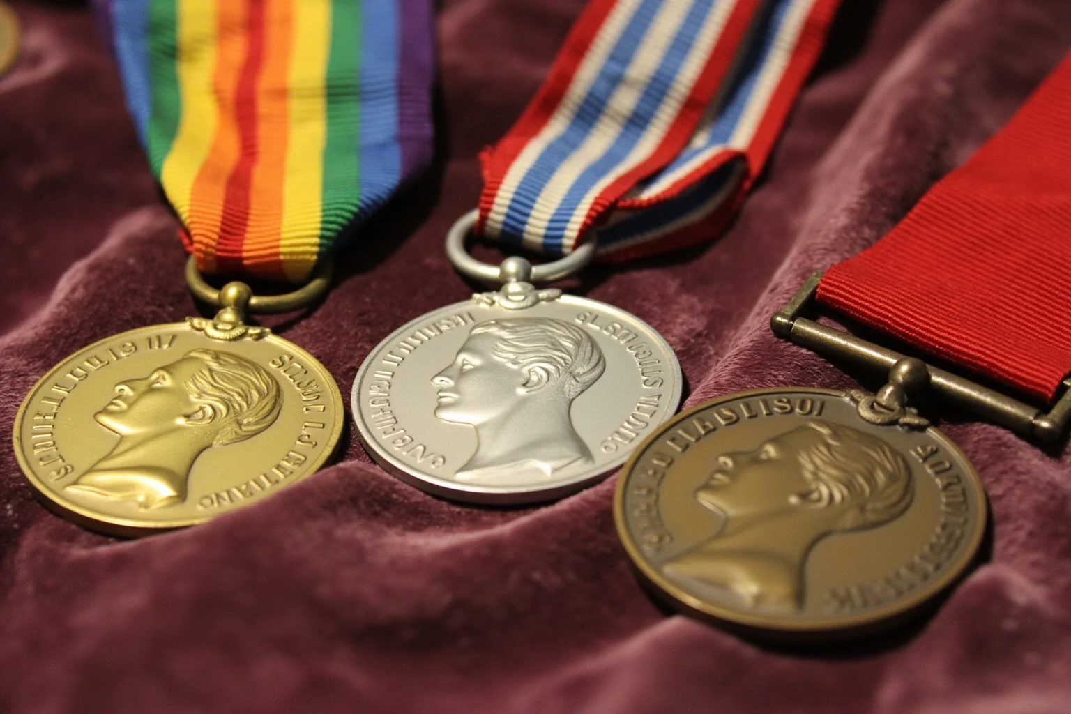
The familiar hierarchy of gold, silver, and bronze was first used at the 1904 St. Louis Games. Before that, winners at the 1900 Paris Olympics received cups and other prizes instead of medals. The 1904 medals were smaller and simpler than later designs, but they set the template that every subsequent Games would follow.
3. The 1908 London Medals Introduced the Classic Trionfo Design
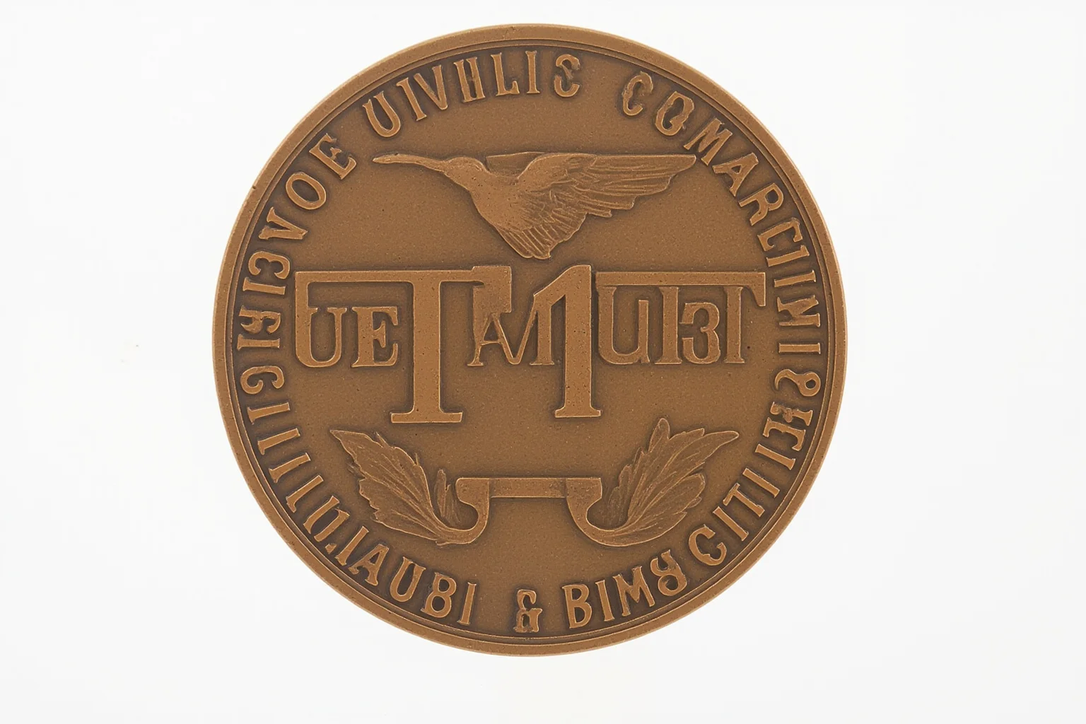
For the 1908 London Olympics, organizers commissioned a design by Bertram Mackennal that showed a winged figure of Victory, known as Trionfo, on the front. The reverse featured St. George slaying a dragon. This design was so popular that it was reused, with modifications, for decades. It helped establish the idea that Olympic medals could be both symbolic and artistically ambitious.
4. The 1928 Amsterdam Design Became the Longest-Running Template
The 1928 Amsterdam Olympics introduced a medal design by Giuseppe Cassioli that would define the look of Summer Olympic medals for nearly 80 years. The front showed the goddess Nike seated, holding a palm frond and a winner's crown, with the Colosseum in the background. The reverse featured a crowd of athletes carrying a victorious champion. This design was used, with minor changes, from 1928 until 2004.
5. The Colosseum Was an Odd Choice for the Olympics
Cassioli's design placed the Colosseum, a Roman amphitheater, on the medal even though the ancient Olympics were Greek, not Roman. This historical mix-up went largely unnoticed for decades. It became one of the weird quirks of Olympic medal design, a Roman landmark standing in for a Greek tradition.
6. Winter Olympic Medals Took a Different Path
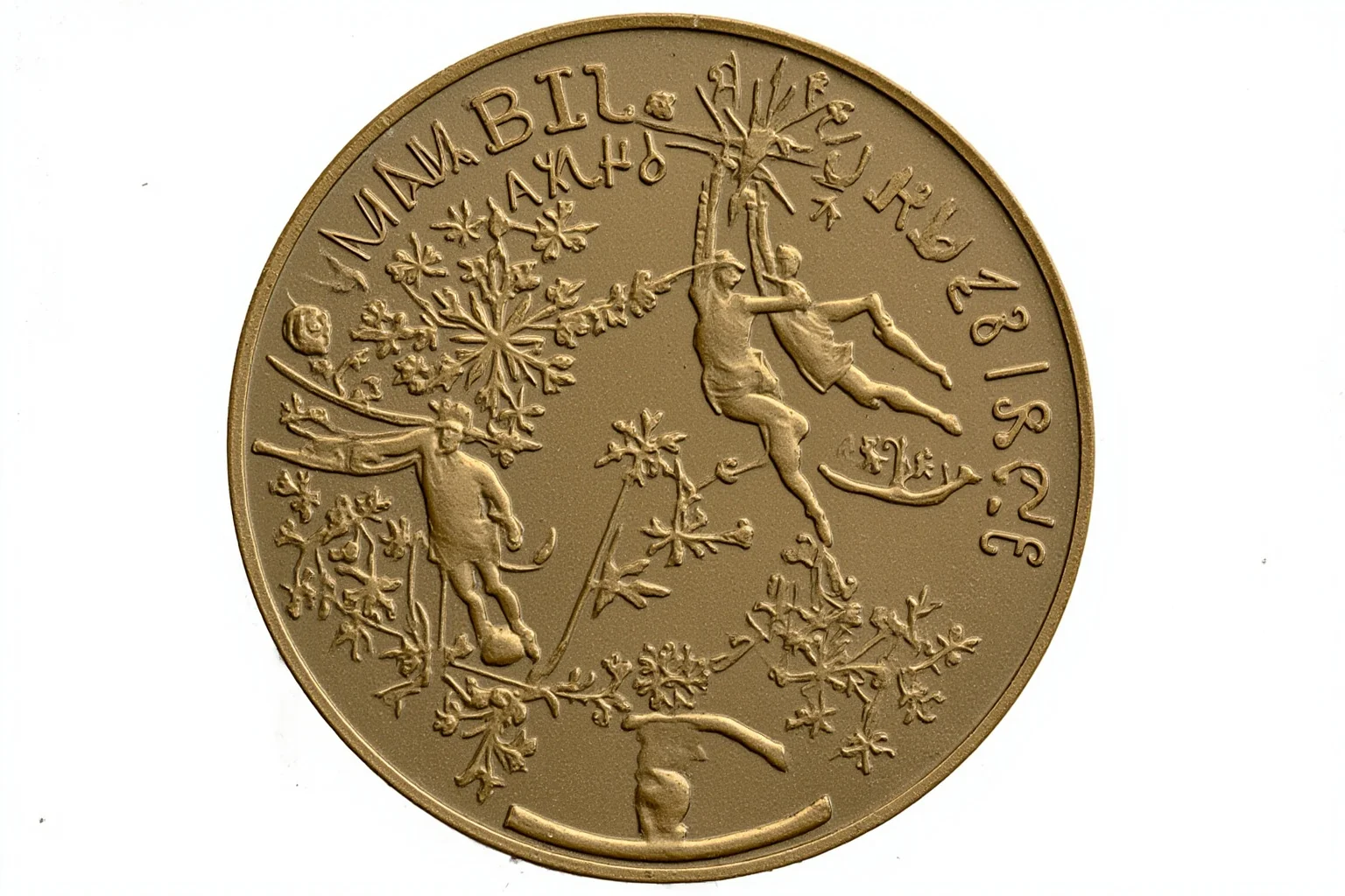
The Winter Olympics, first held in 1924, developed their own medal traditions. Early Winter medals often featured winter sports scenes, mountains, and snowflakes rather than classical figures. This separation allowed for more creative freedom, and Winter medal designs often became more experimental than their Summer counterparts.
7. Host Cities Began Customizing the Reverse Side
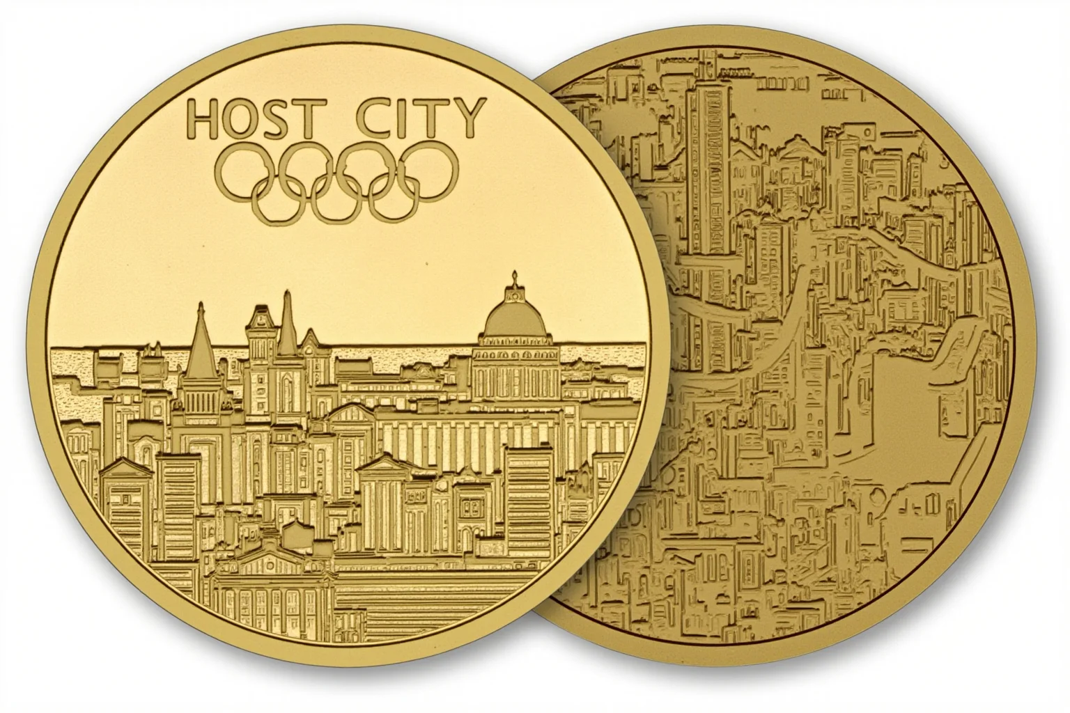
Starting in the mid-20th century, host cities were allowed to create their own design for the reverse of the medal while keeping the front standard. This led to a wide variety of Olympic medal designs, from abstract patterns to detailed cityscapes. It gave each Games a unique artistic signature while preserving a unifying symbol.
8. The 1960 Rome Medals Featured a Unique Chain and Wreath
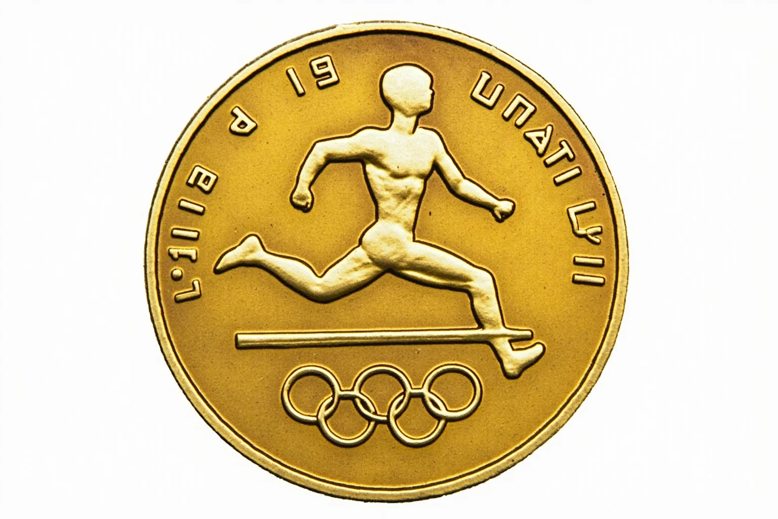
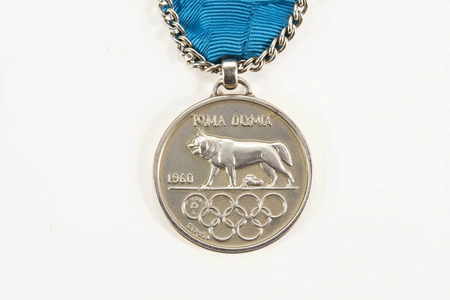
The 1960 Rome Olympics produced a distinctive medal that hung from a chain rather than a ribbon. The design included a bronze wreath and a depiction of a she-wolf, the symbol of Rome. It was a bold departure from the standard ribbon-and-disc format, and it remains a favorite among collectors.
9. The 1972 Munich Medals Were Designed by a Famous Artist

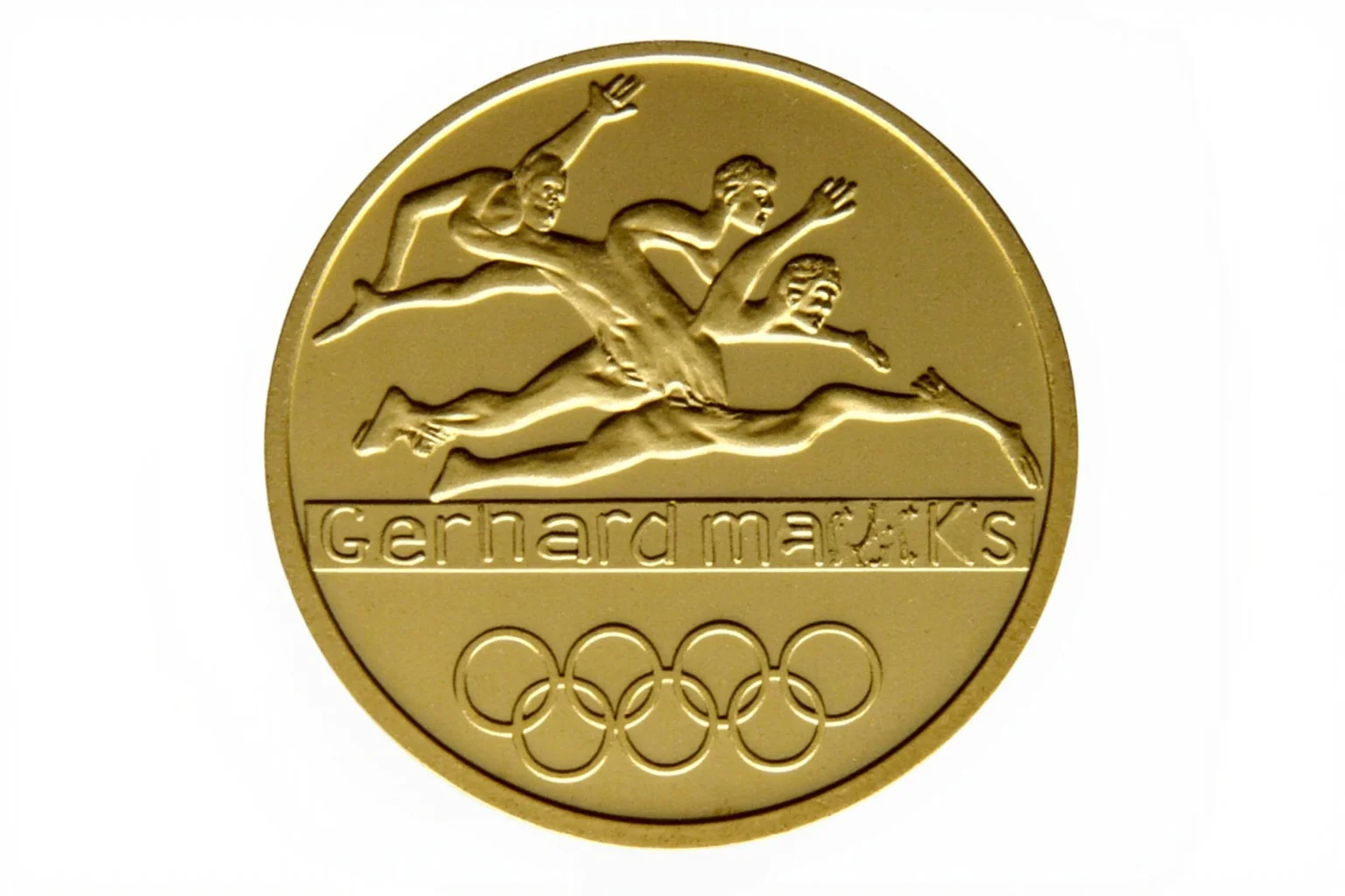
For the 1972 Munich Games, organizers tapped Gerhard Marcks, a renowned German sculptor, to design the medals. His abstract design featured a stylized athlete and the Olympic rings, with a focus on clean lines and modernity. It was a departure from the classical style and showed that Olympic medal design could be contemporary art.
10. The 1984 Los Angeles Medals Went for a Sleek, Modern Look
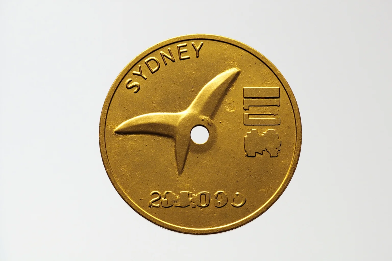
The 1984 Los Angeles Olympics introduced a medal design that was distinctly American and modern. The front featured a stylized athlete and the Olympic rings, while the reverse showed a laurel wreath and the host city's name. The medals were larger and heavier than before, reflecting the growing scale of the Games.
11. The 1992 Barcelona Medals Broke the Mold Entirely
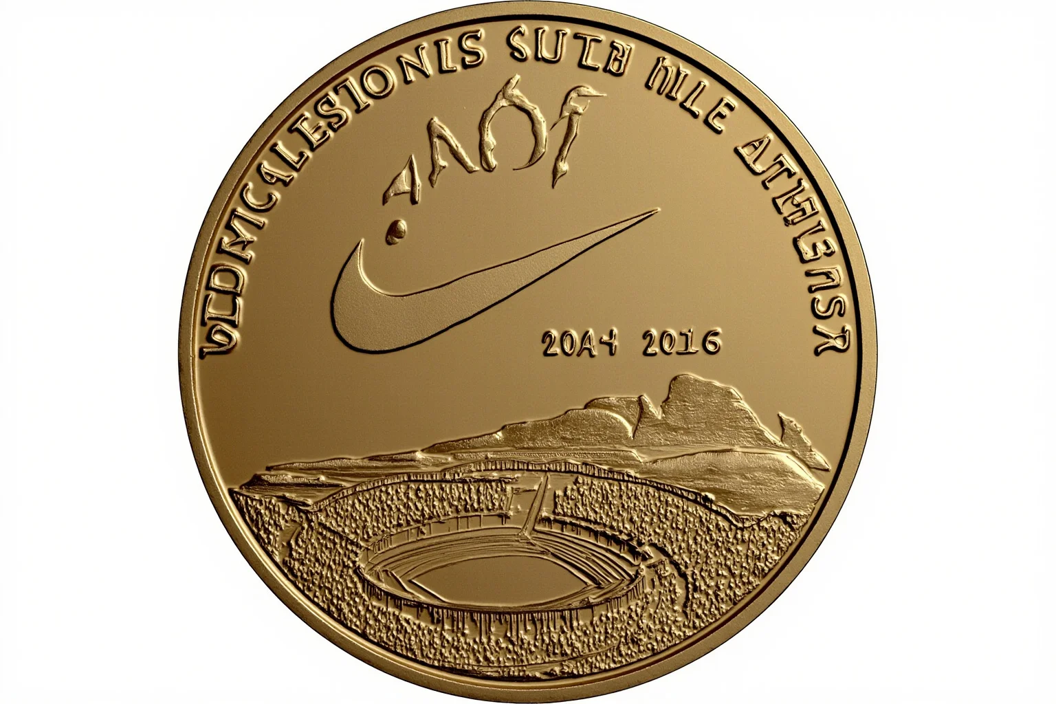
The 1992 Barcelona Olympics featured a radically different design by sculptor Xavier Corberó. The medal was not a perfect circle but had a textured, almost organic shape, and the front did not show the traditional Nike. Instead, it featured a stylized athlete and the Barcelona skyline. This is often cited as one of the best Olympic medal designs for its boldness.
12. The 2000 Sydney Medals Included a Hole in the Center
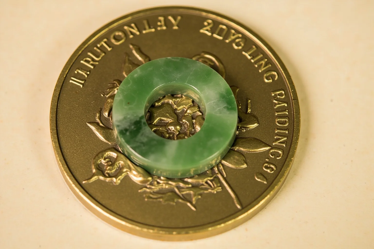
The Sydney 2000 Olympics introduced a medal with a hole in the middle, inspired by the shape of a boomerang and the Australian landscape. The design was meant to represent the meeting of cultures and the unity of the Games. It was a striking departure from the solid disc and showed how far Olympic medal design could go.
13. The 2004 Athens Medals Brought Back Greek Mythology
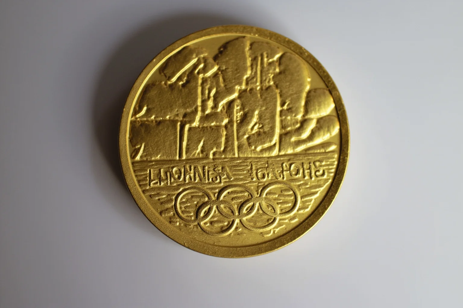
For the 2004 Athens Games, the medals returned to their roots with a design by Elena Votsi. The front featured a winged Nike flying into the Panathenaic Stadium, while the reverse showed the Olympic flame and the opening lines of the Olympic Anthem in Greek. It was a poetic tribute to the ancient origins of the Games.
14. The 2008 Beijing Medals Used Jade for the First Time
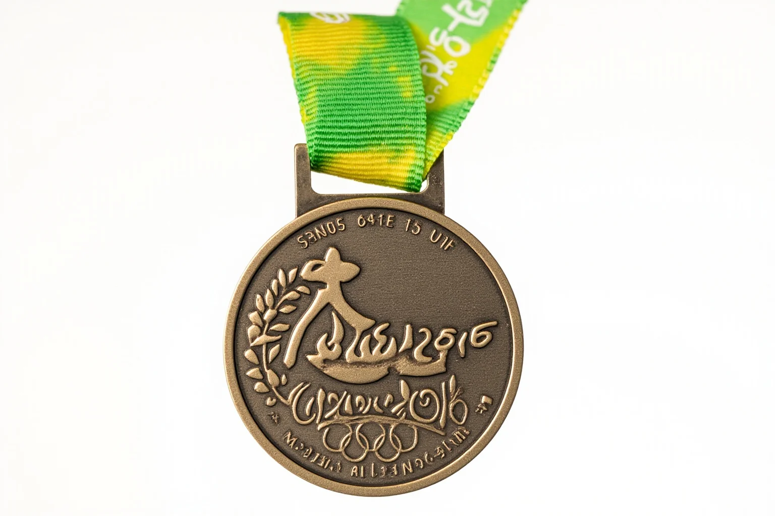
The 2008 Beijing Olympics introduced a unique twist: the medals incorporated jade, a traditional Chinese stone. The gold medal had a ring of white jade, the silver had green jade, and the bronze had white jade. This was the first time a non-metal material was used in Olympic medal design, and it sparked debate about durability and tradition.
15. The 2012 London Medals Were the Largest and Heaviest Yet
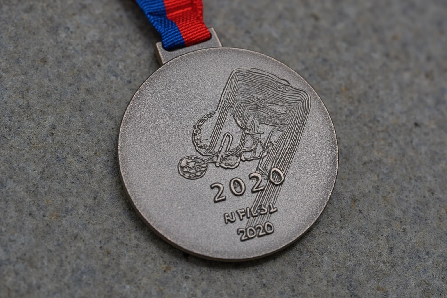
The London 2012 medals, designed by David Watkins, were the largest and heaviest Summer Olympic medals ever made at the time. They featured a stylized depiction of the River Thames and the Olympic rings, with a complex, textured surface. The design was meant to reflect the energy of the city and the athletes.
16. The 2016 Rio Medals Emphasized Sustainability
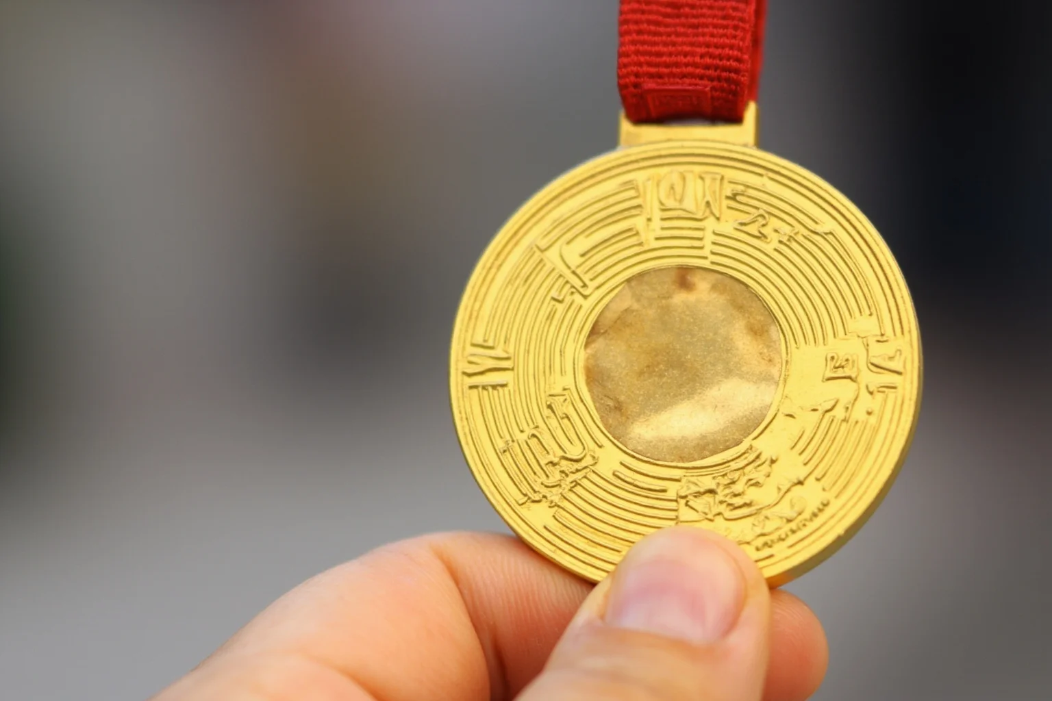
The Rio 2016 medals were designed with sustainability in mind, using recycled materials and avoiding mercury and other harmful substances. The design featured a leaf motif and the Olympic rings, with a focus on natural forms. It was a statement about environmental responsibility as much as artistic achievement.
17. The 2020 Tokyo Medals Were Made from Recycled Electronics
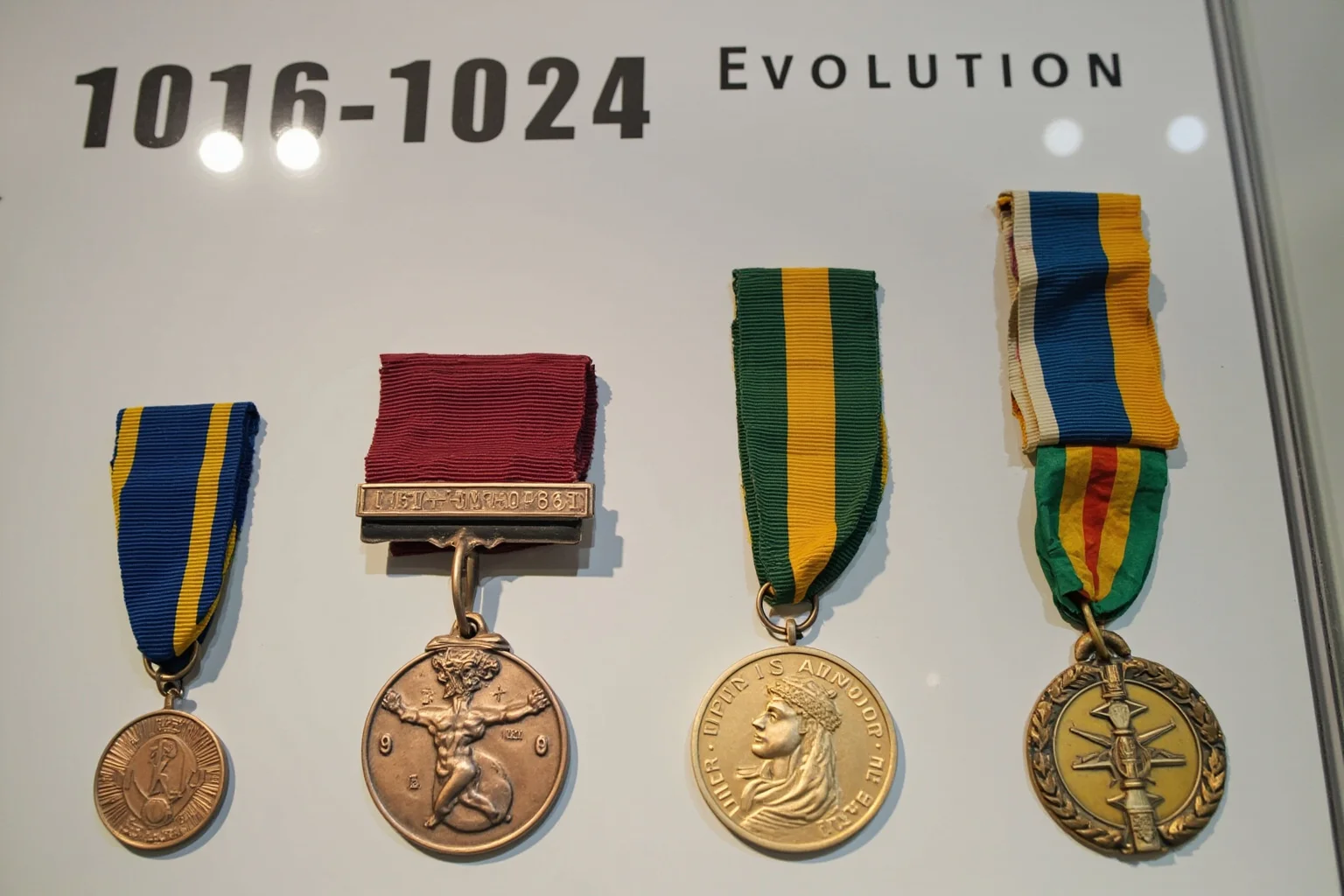
The Tokyo 2020 medals, held in 2021, were made entirely from recycled electronic devices donated by the Japanese public. The design, by Junichi Kawanishi, featured a textured surface that resembled a rough stone, with the Olympic rings and the goddess Nike on the front. It was a powerful symbol of sustainability and civic participation.
18. The 2024 Paris Medals Included a Piece of the Eiffel Tower
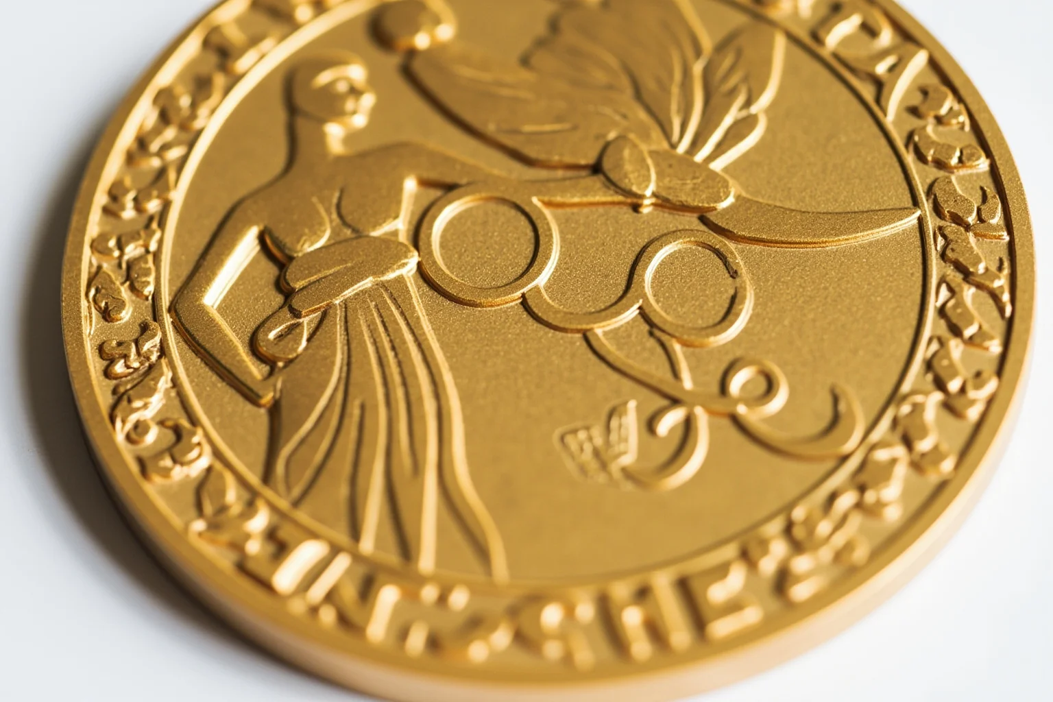
The Paris 2024 medals, designed by Chaumet, featured a hexagonal piece of iron from the Eiffel Tower embedded in the center. The design was a tribute to French craftsmanship and the iconic landmark, and it was immediately hailed as one of the most creative Olympic medal designs in history. It also included the Olympic rings and the goddess Nike on the front.
19. The Reverse Side Has Become a Canvas for Host Cities

Over the decades, the reverse of the medal has become a place for host cities to tell their own story. From Barcelona's abstract shapes to Tokyo's recycled electronics, the reverse is where designers take risks. This has led to some of the most memorable and weird Olympic medal designs, and it shows no sign of slowing down.
20. The Best Olympic Medal Design Is Still Debated
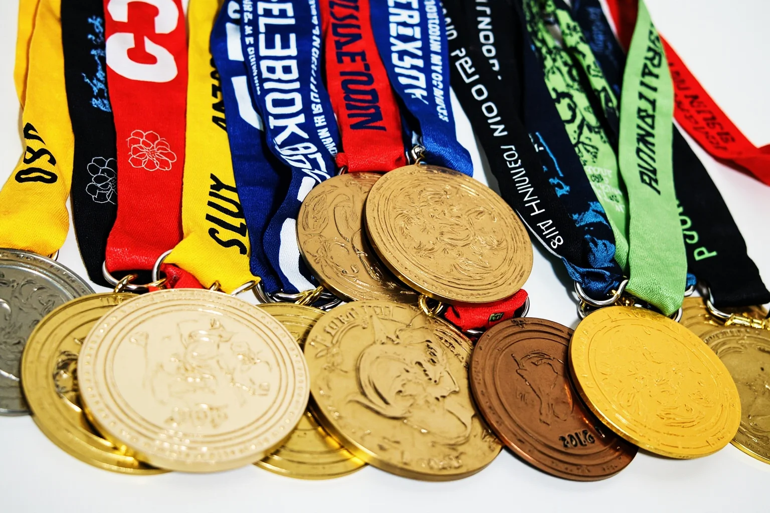
There is no consensus on the best Olympic medal design. Some prefer the classic 1928 Cassioli design for its timelessness, while others champion the boldness of Barcelona 1992 or the craftsmanship of Paris 2024. What is clear is that each design reflects its era, and the debate itself is part of the fun.
21. What Do Olympic Medals Look Like Today?
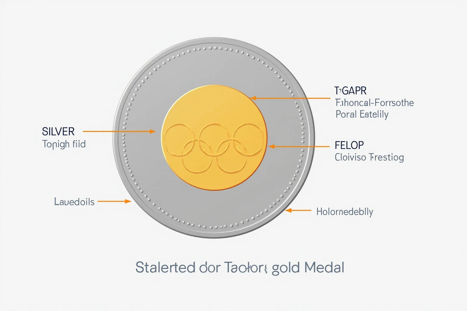
Today, Olympic medals are typically circular, around 85mm in diameter, and made of gold, silver, or bronze. The gold medal is actually mostly silver with a thin layer of gold, while the silver is pure silver, and the bronze is mostly copper. The front usually features the goddess Nike and the Olympic rings, while the reverse is unique to each host city.
22. The Gold Medal Is Not Solid Gold
One of the most persistent myths is that the Olympic gold medal is solid gold. In reality, it is made of silver with a layer of gold that is at least 6 grams. This has been the standard since 1912, the last time solid gold medals were awarded. The design may change, but the composition has remained consistent for over a century.
23. Medal Design Has Always Reflected Politics and Culture
Olympic medal design is never just about art. It reflects the politics, culture, and values of the host city and the era. From the Roman Colosseum on a Greek-themed medal to the recycled electronics of Tokyo, each design tells a story about its time. Understanding this history helps us appreciate what Olympic medals look like and why they matter.
The Weird and Wonderful Legacy of Olympic Medal Design
The history of Olympic medal design is a story of experimentation, tradition, and occasional confusion. From the simple silver of 1896 to the Eiffel Tower iron of 2024, these medals have evolved into highly collectible works of art. They are not just awards; they are snapshots of history.
So the next time you watch the Olympics, take a closer look at the medals. What do the Olympic medals look like? They look like the story of the Games themselves, told in metal, stone, and sometimes jade. And that is a weird and wonderful thing.
If you enjoy stories of how awards and honors evolve over time, you might also like our look at the highest military decorations and obsolete medals, which traces similar shifts in symbolism and status.
And for more tales of intense competition and dramatic turnarounds, see our roundup of the greatest comebacks in sports history.
Frequently Asked Questions
What does the Olympic gold medal look like?
The Olympic gold medal is typically a circular disc about 85mm in diameter, featuring the goddess Nike on the front and a unique design on the reverse. It is made of silver with a layer of at least 6 grams of gold, and the exact design changes with each host city.
What do Olympic medals look like today?
Today's Olympic medals are usually circular and made of gold, silver, or bronze. The front often shows Nike and the Olympic rings, while the reverse is customized by the host city. Recent medals have included unique materials like jade, recycled electronics, and even a piece of the Eiffel Tower.
What is the best Olympic medal design?
There is no single best design, but popular favorites include the classic 1928 Amsterdam design by Giuseppe Cassioli, the bold 1992 Barcelona medal, and the 2024 Paris medal with its Eiffel Tower iron. Each reflects its era and host city.
Are Olympic gold medals solid gold?
No, Olympic gold medals are not solid gold. Since 1912, they have been made of silver with a thin layer of gold, at least 6 grams. The last solid gold medals were awarded at the 1912 Stockholm Olympics.
Why do Olympic medals have different designs?
The front of the medal has traditionally shown a standard image of Nike, but the reverse is designed by the host city to reflect its culture and identity. This allows each Games to have a unique artistic signature while maintaining a unifying symbol.

Alex Warren
Related Articles